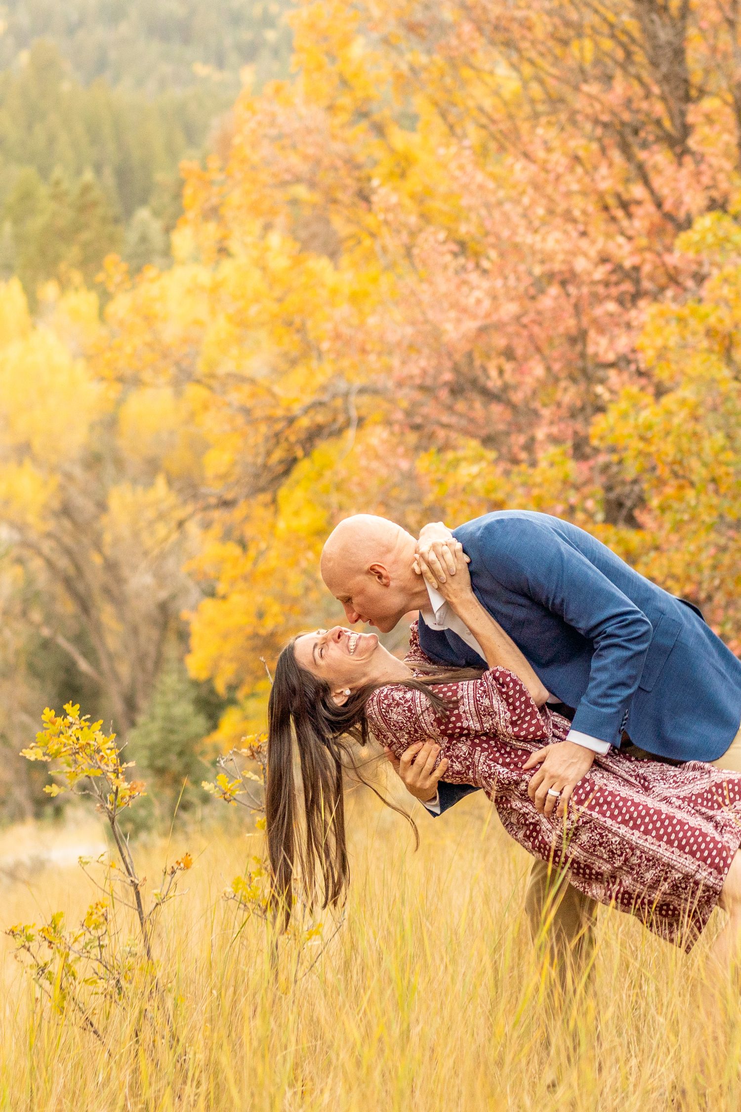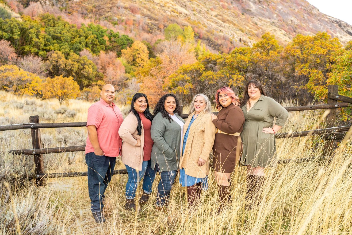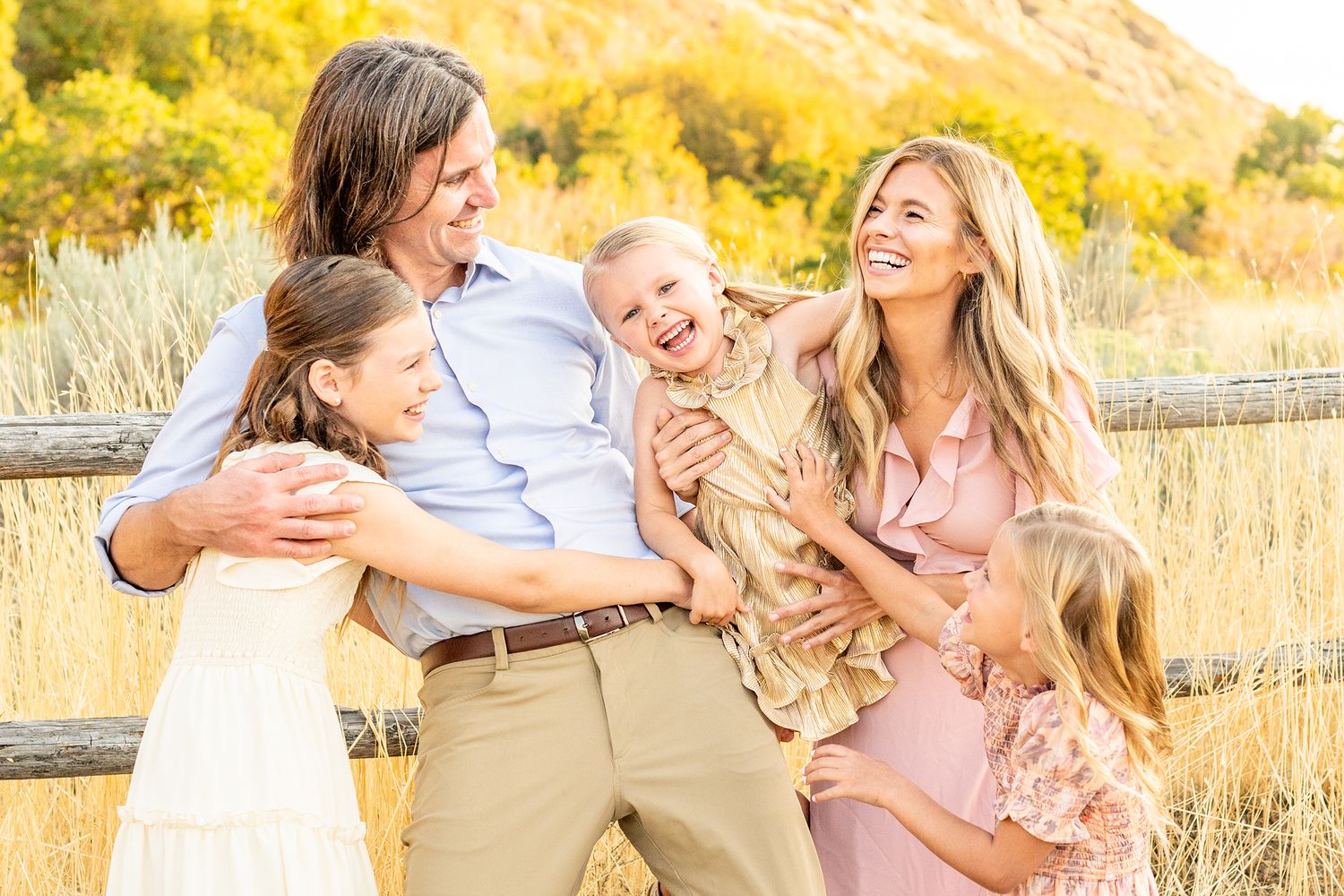
Where to start?!
Choose your theme. By which I mean choose your color scheme. One of my favorite tips? Think about your home.
These photos will likely end up on your walls, so choose colors that match your decor and that you’ll love seeing every day.
Begin with neutrals, and then add one or two accent colors you love. For example: soft pinks, baby blues, sage greens, or mustard tones all work beautifully.
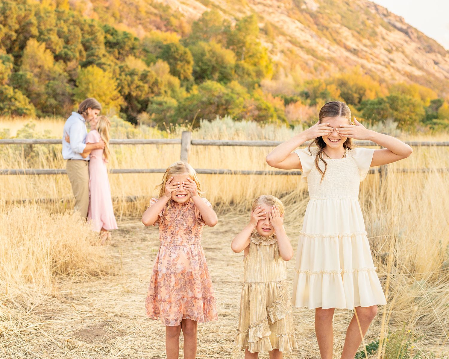
On camera it's a whole different world. You might love the plaid or the hot pink dress, but on camera it will not love you.
Unless you want your dress to be the spotlight follow these tips:
- Keep it SIMPLE. Bold Patterns (plaid & small stripes) act funny on the camera. They create a weird effect on the lens and will keep you from focusing on you.
- Add VARIETY. Ever seen all T-shirt photos, there's a reason they don't look high-end. Having similar colors and different styles and textures of clothing adds variety to your image. It keeps your eye moving and looking at what matters: YOU!
- Go SOFT. What I mean is, keep colors to a dull/muted tone. Bold, bright & neon colors are fun at parties, but in pictures they distract and cast unnatural colors onto the skin that ultimately are unflattering.
Here are 2 Photoshopped Examples of what not to wear:
What not to wear!
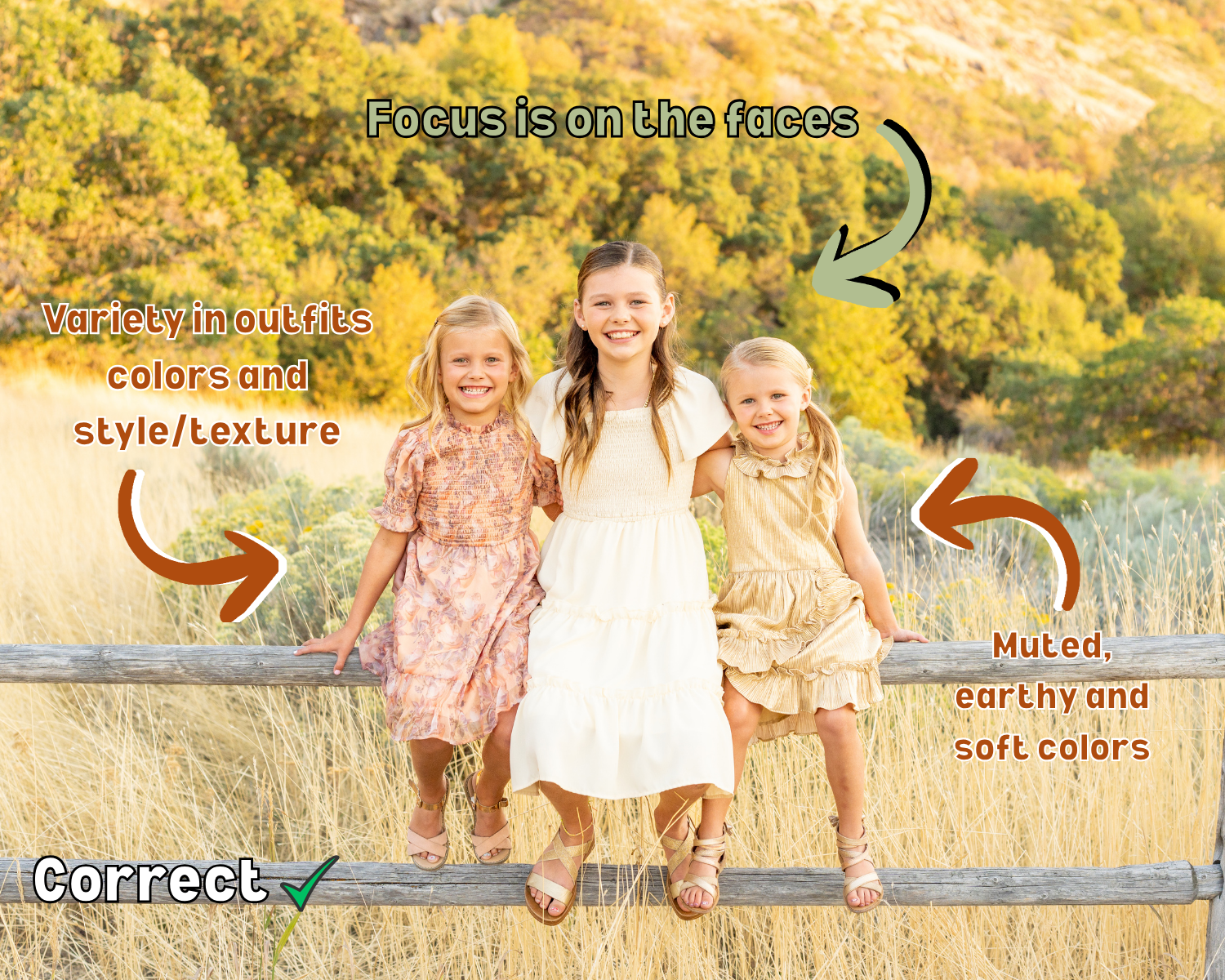
I can say all I want about outfits, but sometimes it's just hard to picture it without- well, a picture!
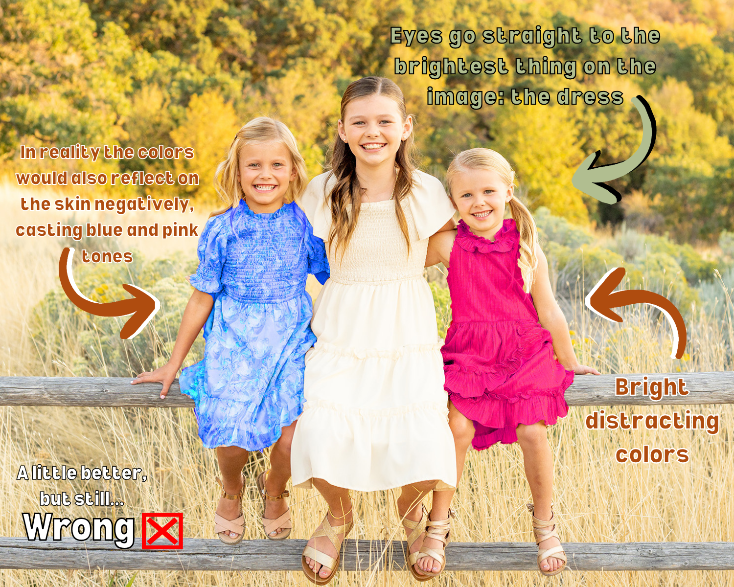
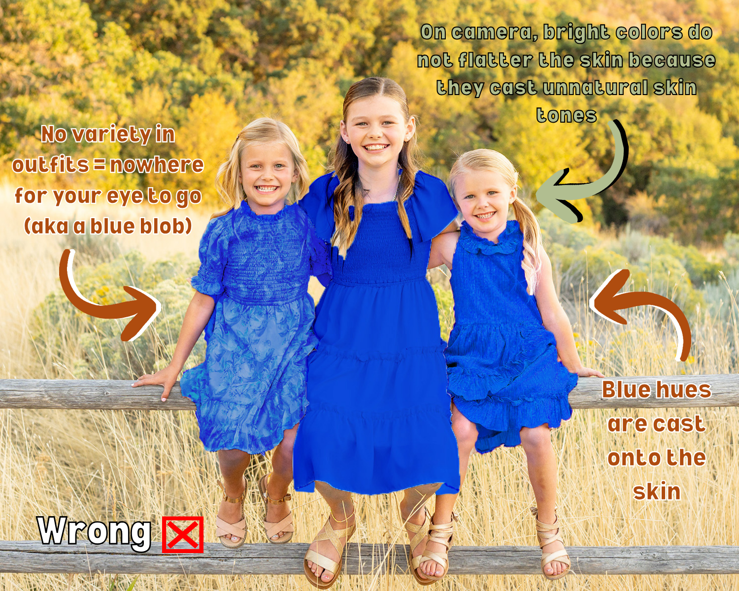
Hopefully these edited images can explain a little better than I did on what not to wear to a photoshoot.